A barebones card, without footer, header, heading, image – or much of anything, really.
Cards
A flexible multi-purpose component
Cards are represented using the <article> tag.
They have a different background and a slight border shadow, making them
appear slightly raised. They are best contained in grid or
cols since they lose much of their visual impact if they
grow too wide.
Cards can have a footer, a header or both; these have an accented background. Images in the header are handled specially, as can be seen below.
Good times
This card has both a header and a footer.

With an image
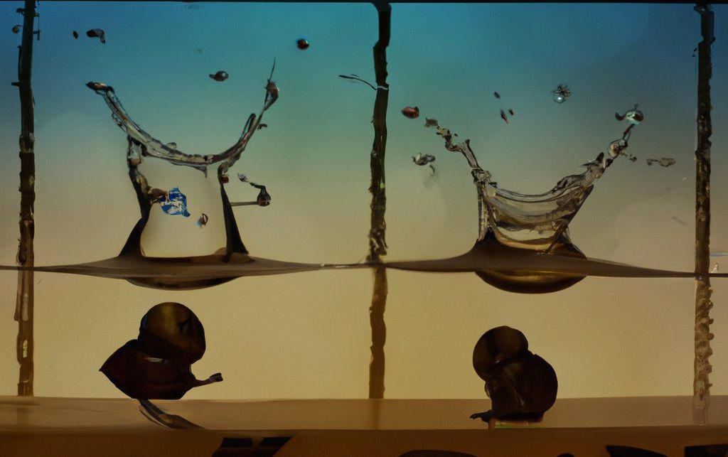
This card has an image (with a link) in the header. Note how the image fills the header completely, without any padding or margins.
<div class="grid-sm c2 c3-md">
  <article>
    <p>
      A barebones card, without footer, header, heading, image
      – or much of anything, really.
    </p>
  </article>
  <article>
    <header><h4>Good times</h4></header>
    <p>This card has both a header and a footer.</p>
    <footer><p class="smaller ta-c">Footering around</p></footer>
  </article>
  <article>
    <header>
      <a href="#"><img src="/img/dalle.jpg"></a>
    </header>
    <h4>With an image</h4>
    <p>This card has an image (with a link) in the header.
      Note how the image fills the header completely,
      without any padding or margins.</p>
  </article>
</div>